

Lumo offers rented apartments for urban citizens around Finland. The market is extremely competed and standing out is challenging. The main task was to strengthen the Lumo brand, ideology and services, standing out among competitors.
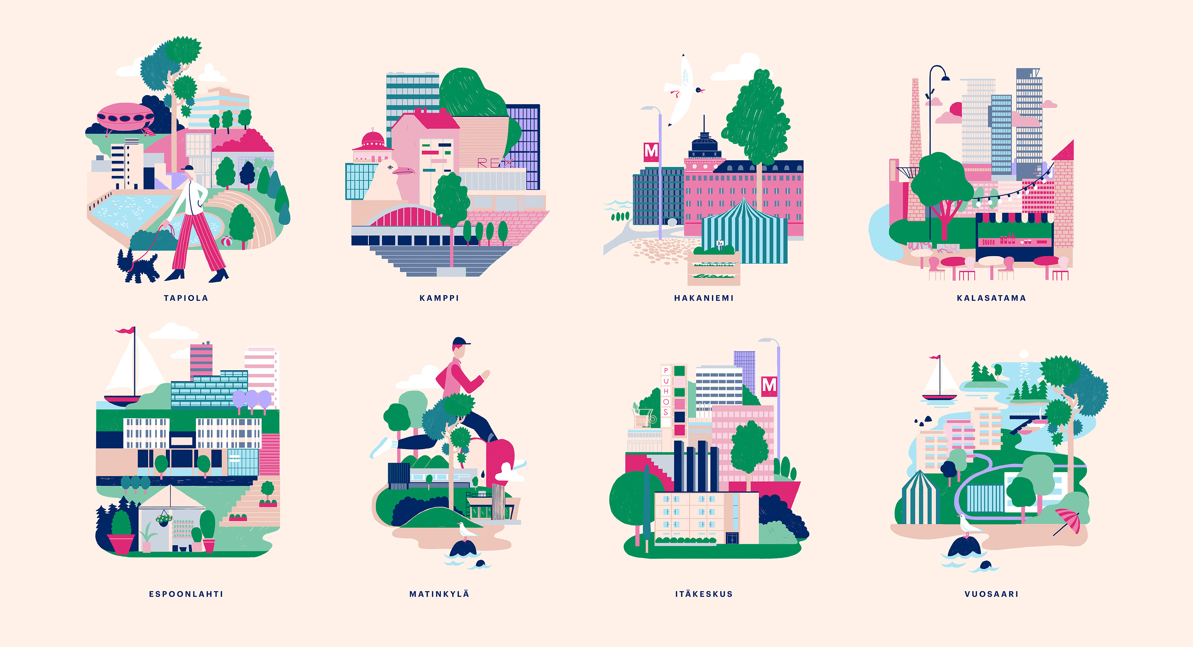
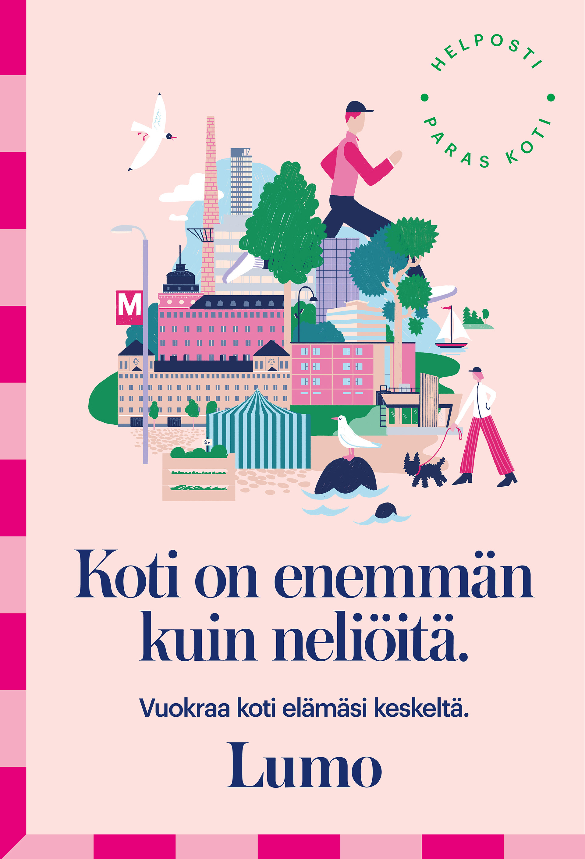
The new brand identity allowed an illustrational style that utilizes a fresher color palette, reaching the desired target audience, style savvy urban citizens, to turn their gaze in Lumo’s direction.
The illustrational style expresses an urban identity, in which ‘home’ is a wider concept than the square meters of an apartment. Home expands to picnics in the park, seagull screeches and that glass of wine in the neighborhood bar. The light hand-drawn lines and surfaces come to life, highlighting the different details of home and a personal way of life.